Health Reports are Not Written For You
On March 22, 2020, the Johns
Hopkins University Center for Systems Science and Engineering launched what
would become the most-consulted scientific resource of the pandemic: a
real-time global dashboard tracking confirmed COVID-19 cases, deaths, and recoveries
across more than 180 countries (Dong et al., 2020). Within weeks it was drawing
tens of millions of daily visitors. Governments cited it in press briefings,
journalists read from it on the nightly news, and parents checked it before
deciding whether to keep children home from school.
The dashboard, however, was not designed to help any of those people make any of those decisions.
This is not a criticism of the Johns Hopkins team. In fact, the dashboard was a remarkable achievement in epidemiological data aggregation, built to give researchers and public health authorities a standardized, comparable view of how the outbreak was spreading across jurisdictions. But what it tracked, primarily confirmed cases aggregated by country and territory, reflected what was measurable and comparable internationally, not what was most useful to a household trying to assess its own risk. Confirmed case counts depended almost entirely on testing capacity, which varied enormously across countries and communities. When testing was scarce, counts were low: not because transmission was low, but because most infections went undetected (Manski & Molinari, 2021). A dashboard reading "5,000 confirmed cases" in a country with limited testing infrastructure told you almost nothing about whether the virus had reached your street. Yet hundreds of millions of people consulted it anyway. A tool built for one kind of reader became the primary pandemic resource for a very different kind.
That gap, between who a health document is written for and who actually reads it, is not an accident of the digital age. Between 1946 and 1952, the United States Congress received annual reports on health conditions in the Philippines under the Philippine Rehabilitation Act of 1946. These were detailed, conscientious documents containing tuberculosis prevalence rates, malaria statistics, nutrition surveys, and hospital reconstruction figures. They looked comprehensive, and in a narrow sense they were: they were not written for Filipinos.
The reports were addressed to American legislators who needed to be convinced that U.S. rehabilitation funds were being spent responsibly, that the Philippine government was recovering, and that continued American investment made strategic sense. Reading them carefully, three things become clear about how thoroughly that audience shaped what the reports contained.
The most subtle is also the most fundamental. The disease categories that appeared in the reports were not chosen fresh in 1946. Instead, they came from a classification infrastructure that the American colonial administration had built in the islands decades earlier, designed to track diseases that mattered to U.S. military and agricultural interests: cholera, malaria, venereal disease, smallpox, beriberi. Those categories survived the transition from colony to commonwealth to formal independence because the reporting apparatus that produced them survived. Filipino health officials in 1947 were not deciding from scratch which diseases to count. They were inheriting a counting system built by a different government, for a different era, with a different set of priorities (U.S. Department of State, 1954; Anderson, 2006). The map of Philippine disease that appeared in the postwar reports was drawn on a grid installed by American colonial administrators, and the grid, inevitably, shaped what could be seen.
That inherited grid had a further consequence. The reports did not include everything the Philippine health situation involved; they included only what was measurable in terms the primary audience recognized, and what helped answer the questions the appropriations committee was asking. The health of rural communities in central Luzon, where the Huk insurgency had disrupted basic services and made organized data collection nearly impossible, was largely absent, not because conditions there were good but because those conditions were difficult to document and, in the Washington context, difficult to interpret: they did not fit the recovery narrative the reports were built to tell (Greenberg, 1987; Philippine War Damage Commission, 1947–1951). Absence from a report, in other words, is not the same as absence from the population. What appeared was what was legible to the reader, and the rest fell out of the picture.
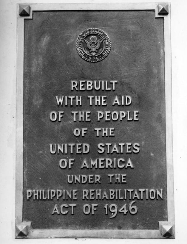
The deepest shaping, though, was in the benchmarks. The criteria used to measure "progress" tracked what Congress needed to believe, not what Filipino health administrators were actually trying to achieve. Reopened hospitals, nurses deployed, vaccination campaigns completed: these were the indicators, and they told the story that rehabilitation funds were working. They did not tell the story of whether the populations who needed the health system most were actually reaching it. A 1954 retrospective report to the U.S. President described an information campaign directed at American taxpayers, not Filipino patients. Every rebuilt public building received a bronze plaque inscribed: "Rebuilt with the aid of the people of the United States of America under the Philippine Rehabilitation Act of 1946" (U.S. Department of State, 1954, p. 16). These plaques stood on Philippine soil, but they were addressed to American observers, inscriptions that performed the terms of American generosity for an audience that needed to see the return on its investment.
The reports were not dishonest, which is precisely the point. Their honesty was organized around a particular audience's questions, and everything accurate in them was accurate in relation to what Congress needed to know. The Philippines that appeared in the reports was real; it simply was not the whole Philippines. It was the Philippines as seen from Washington, in the categories Washington could read, measured against the benchmarks Washington had reason to care about.
The postwar Philippines, then, is one instance of a pattern that predates it and has outlasted it considerably, because the same logic runs through health reporting today, in every country, at every scale.
Every health report is produced for a primary reader, and that reader is almost never the general public. WHO situation reports are addressed to member-state health ministries, not to households deciding whether to travel. National ministry dashboards are calibrated for cabinet briefings, international reporting obligations, and political accountability. Hospital performance data is written for accreditation bodies and insurers. Even the public-facing COVID dashboards that ran on television screens and newspaper front pages were primarily designed to demonstrate that governments were tracking the outbreak, not to help a family in Quezon City, or Hong Kong, or Lagos, assess their own exposure.
The reason this happens is not corruption. Reports simplify, and simplification requires choices about what to include and what to leave out; those choices follow the priorities of the primary audience. When the general public reads a health document made for someone else, they are reading a document whose categories, benchmarks, and silences were determined by concerns that were not theirs.
Knowing this changes what one should look for when opening a health report or glance at a public dashboard. Standard health literacy teaches people to interpret data: to understand what a case fatality rate means, to distinguish correlation from causation, to weigh relative against absolute risk. These skills matter. But they rest on an assumption that often goes unexamined: that the data was gathered and presented with you in mind.
The more important skill, and the one almost never taught, is to ask an earlier question. Who is this document talking to? What does that audience need to believe?
Asking it consistently opens up a set of practical habits. When one reads a health report, one should also notice which populations appear in disaggregated form and which are lumped together, because disaggregation follows institutional priorities, not epidemiology: when a subpopulation does not appear on its own, it is often because the primary audience had no particular reason to track it. Notice which diseases are counted and which are not; the list of conditions in any report reflects a classification system built at a particular moment, for particular purposes, and inherited rather than freshly chosen. Notice the benchmark used to define progress or risk, and ask whose definition of progress it is, progress toward what, measured how, and for whose benefit. Notice, above all, when a public health document is primarily a political accountability document wearing epidemiological clothes.
These habits have policy consequences, and those consequences deserve to be stated plainly. Health agencies should be required to disclose the primary intended audience for their public-facing reports and the institutional questions those reports are designed to answer. This would not embarrass the agencies; it would clarify the function of documents that currently claim a universality they cannot deliver. Disaggregation standards should be set by epidemiological need, not by what is convenient for the reporting body, because what gets disaggregated determines who can be seen when things go wrong. Governments and international donors should fund reporting systems oriented toward household decision-making as a distinct function, separate from institutional accountability, since these are genuinely different tasks that current infrastructure conflates. The journalism and civil society work that translates health data for public audiences should be treated as a core part of the public health system, not as an optional supplement that disappears when the immediate crisis passes.
None of this requires dismantling what exists. The infrastructure that serves institutional readers is largely doing its job. What is missing is infrastructure built for everyone else, and building it starts with acknowledging that the gap is structural rather than incidental.
Which brings us back to the dashboard.
You are still looking at it. The confirmed case counts are rising in one country, falling in another, and the color-coded map tells you something is happening somewhere. But the question has changed. Instead of asking what this tells you about your risk, you are asking what this was built to measure, for whom it was built to be convincing, and what it cannot see.
That is not a cynical question. It is a more accurate one, and accuracy, in the end, is what health literacy is supposed to be about.
References
Anderson, W. (2006). Colonial pathologies: American tropical medicine, race, and hygiene in the Philippines. Duke University Press.
Dong, E., Du, H., & Gardner, L. (2020). An interactive web-based dashboard to track COVID-19 in real time. The Lancet Infectious Diseases, 20(5), 533–534. https://doi.org/10.1016/S1473-3099(20)30120-1
Greenberg, L. M. (1987). The Hukbalahap insurrection: A case study of a successful anti-insurgency operation in the Philippines, 1946–1955. U.S. Army Center of Military History.
Manski, C. F., & Molinari, F. (2021). Estimating the COVID-19 infection rate: Anatomy of an inference problem. Journal of Econometrics, 220(1), 181–192. https://doi.org/10.1016/j.jeconom.2020.04.041
Philippine War Damage Commission. (1947–1951). Semiannual report (Nos. 1–9). U.S. Government Printing Office.
Republic of the Philippines. (1946). Philippine Rehabilitation Act (S. 1610), Public Law 370, 79th Congress, 60 Stat. 128.
U.S. Department of State. (1954). The Philippine rehabilitation program (Publication 5611, Far Eastern Series 67). U.S. Government Printing Office.
U.S. House Committee on Foreign Affairs. (1950). Hearings on S. 1033 and H.R. 7600, to amend the Philippine Rehabilitation Act of 1946: October 3, 1949, February 14, and April 24, 1950. U.S. Government Printing Office.